Meteorologists show their ‘stripes' to help raise awareness about climate change
Meteorologists from around the world showed their “stripes” on Saturday, June 20, to raise awareness and start the conversation about climate change.
“They’re really meant to be simple and be a visual communication tool that we can use to start these conversations about our changing climate, what’s going on and why it matters,” explains Kaitlyn Trudeau, an Applied Climate Scientist with the non-profit organization Climate Central.
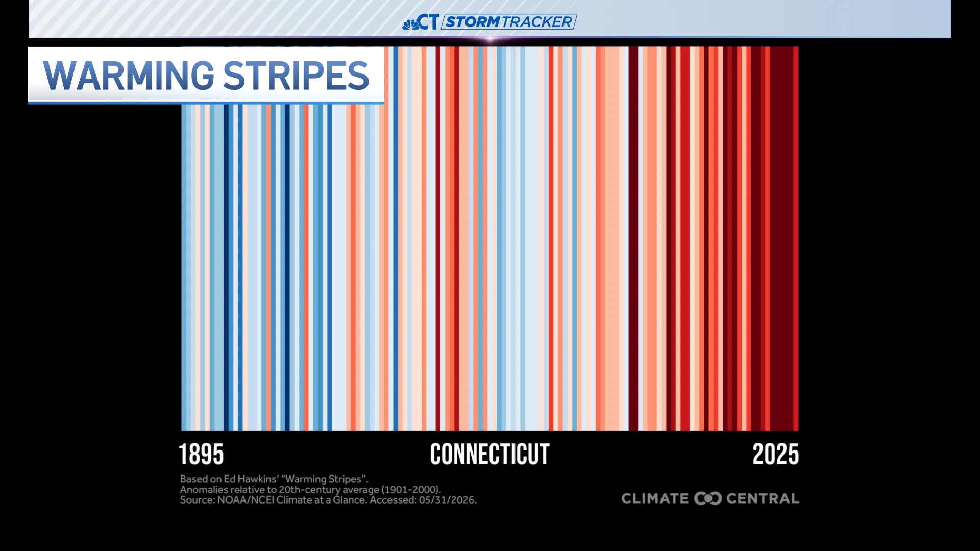
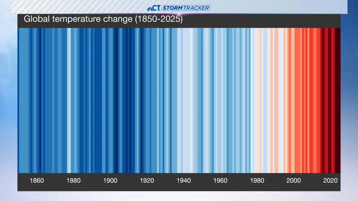
Each colored stripe represents the annual average temperature relative to a long-term average. Red stripes are years that were hotter than average. Blue stripes are years that were cooler. In Connecticut, our hottest year was 2012, and our state follows a common trend of red stripes in recent decades, reflecting rapid warming due to heat-trapping pollution.
“I think that seeing so many of the oranges and reds in recent years, it tracks with what I feel like we’ve experienced, but it’s really concerning,” says Trudeau.
The red stripes in recent warm years increase extreme weather. That can lead to impacts on health, agriculture, and economies around the world.
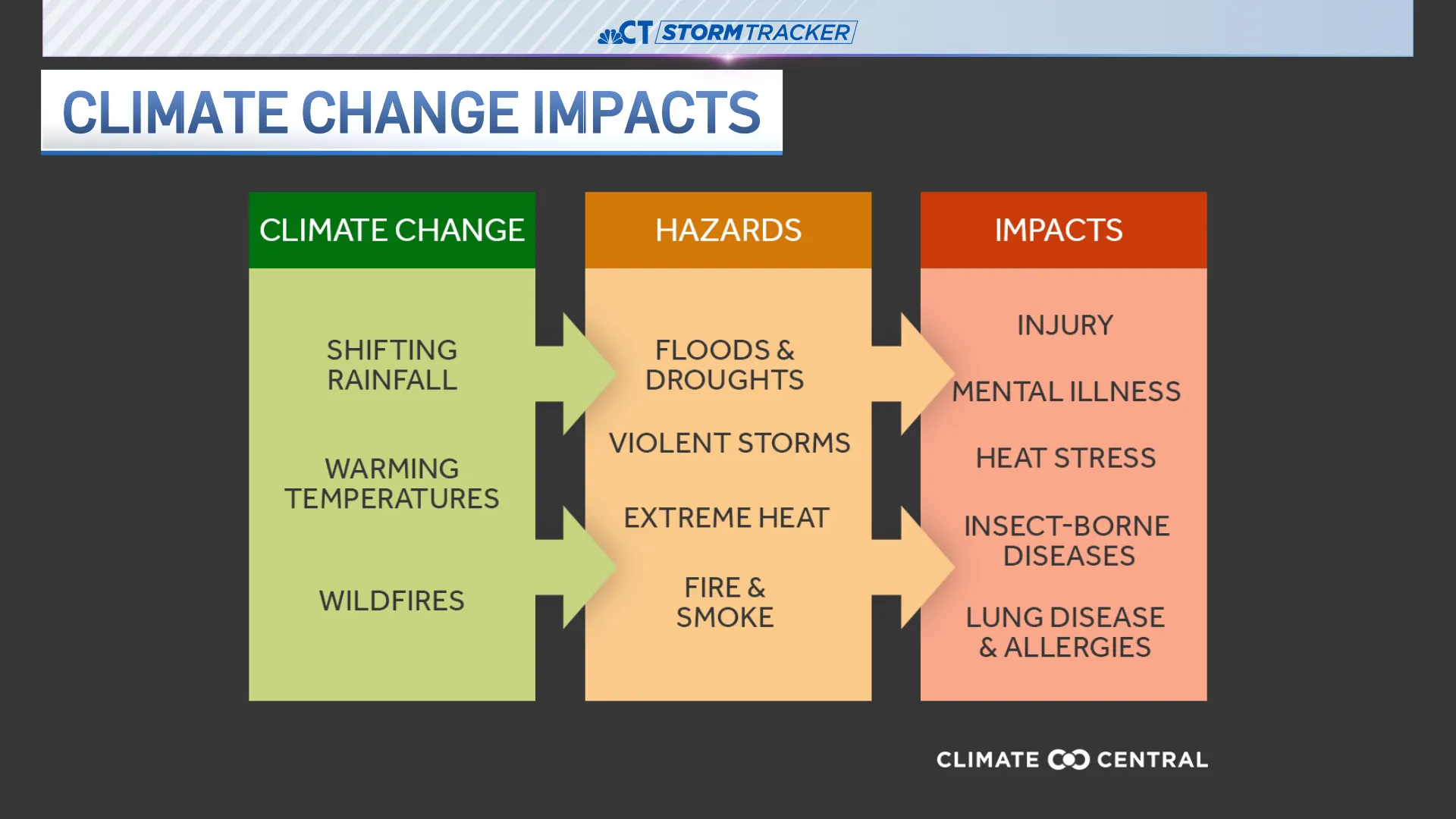
“We’re seeing a major uptick in extreme weather that’s not just dangerous,” says Trudeau. She continues, “It’s extremely costly. And a lot of people are losing everything that they have, everything they’ve worked for, just with a single storm.”
Typically, meteorologists from around the world will showcase their warming stripes on or around the first day of summer in the Northern Hemisphere. It was started by Ed Hawkins of the University of Reading in England.


From breaking news and local politics to art exhibitions, live music, high school sports, small businesses, and cultural events, we celebrate the people and places that make Connecticut unique.